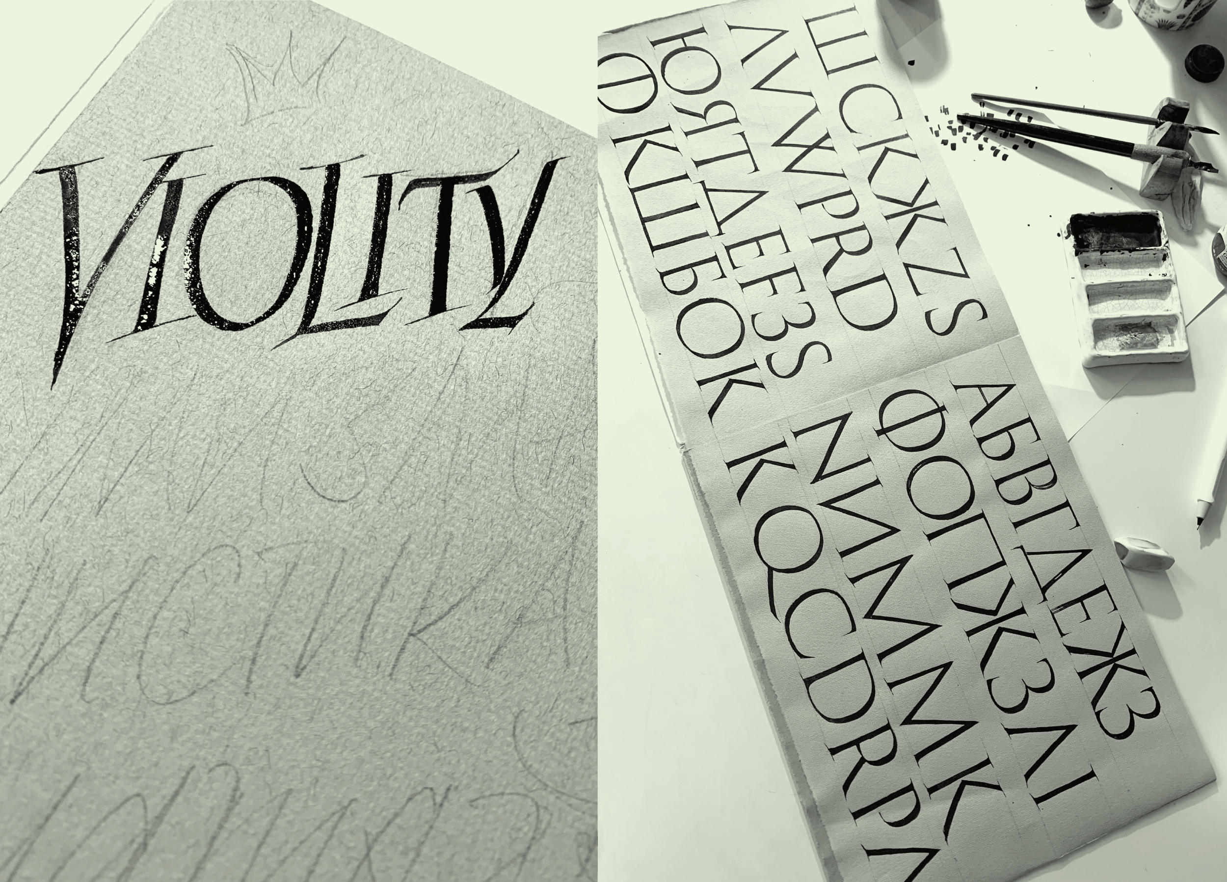
The typeface was developed as a logical continuation of the logo for Violity, and the logo for Violity was a redesign of my own (Vika’s) work in 2015.
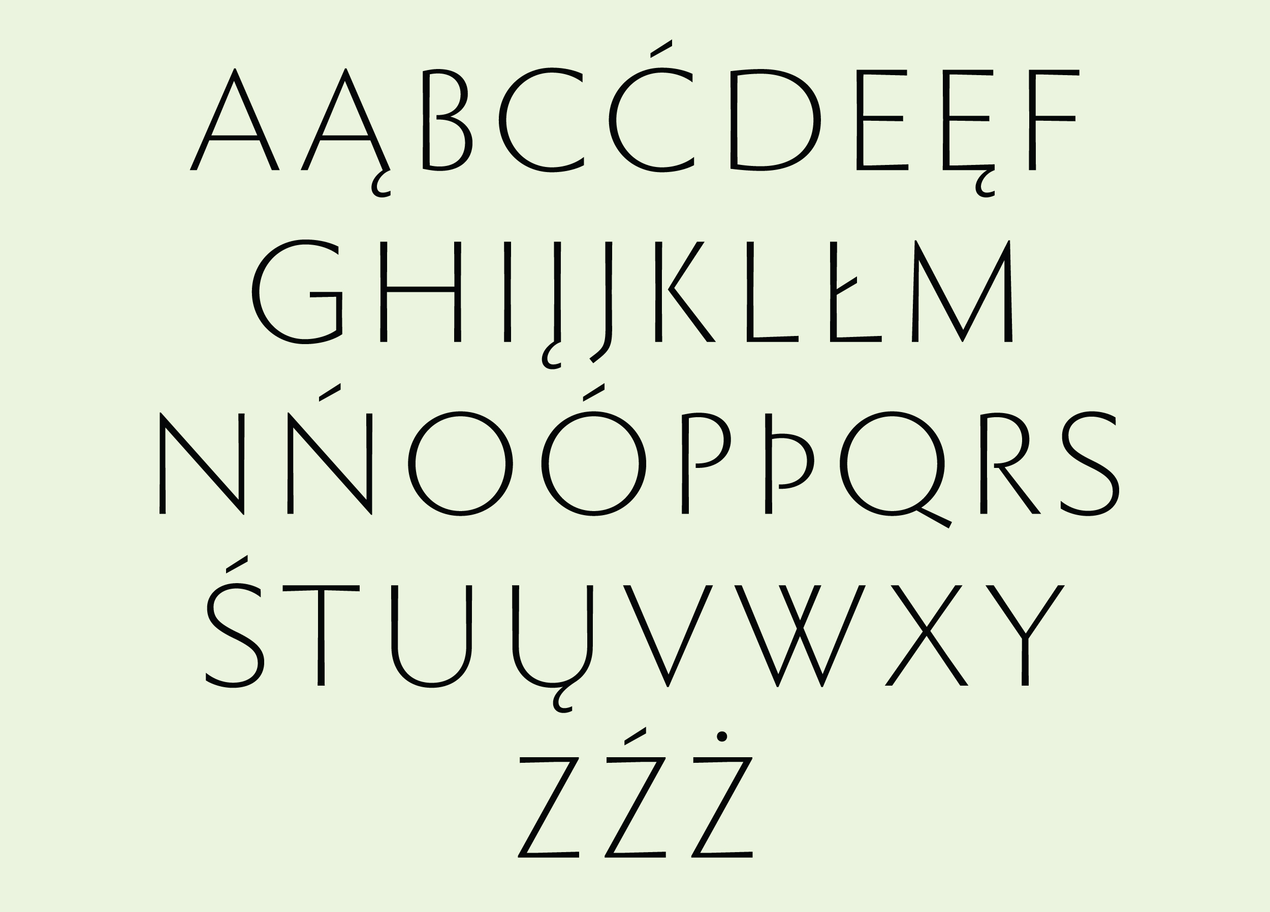
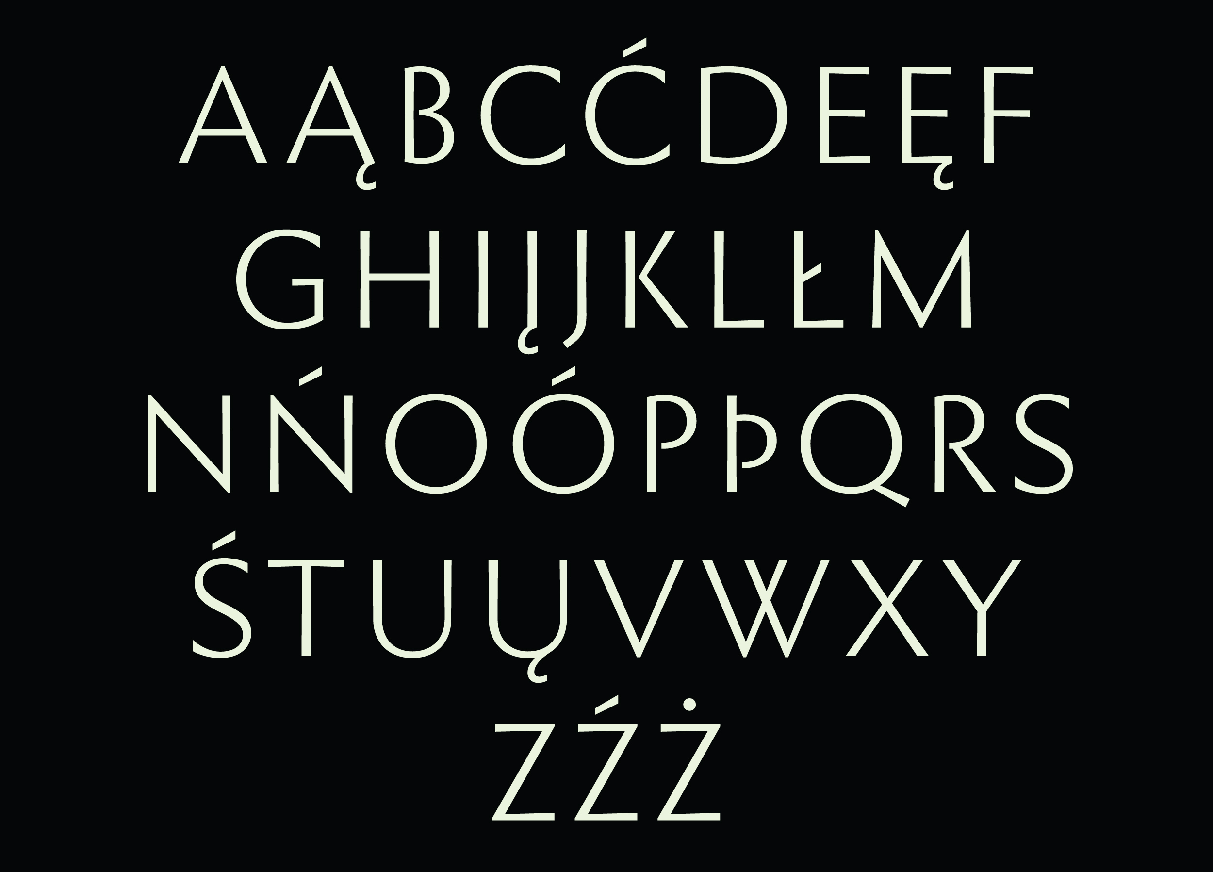
The typeface was based on the proportions of the Roman capital font from Trajan’s column in Rome, which I was actively practicing and writing with a pen and a brush.
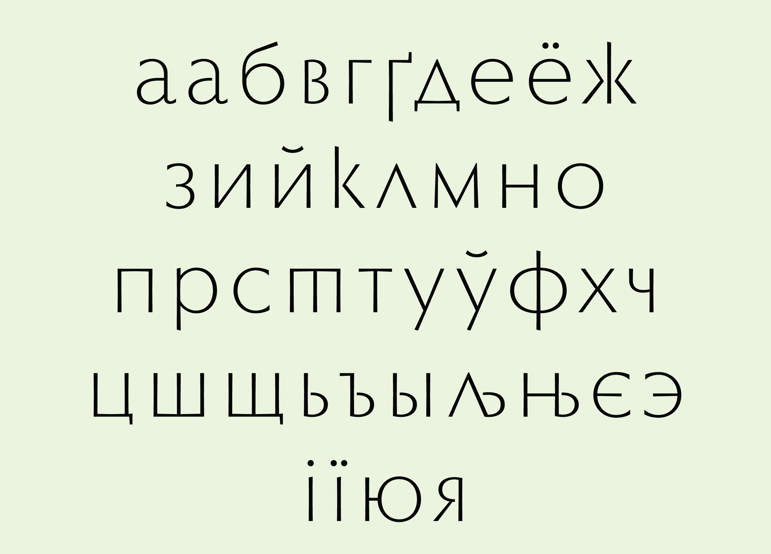
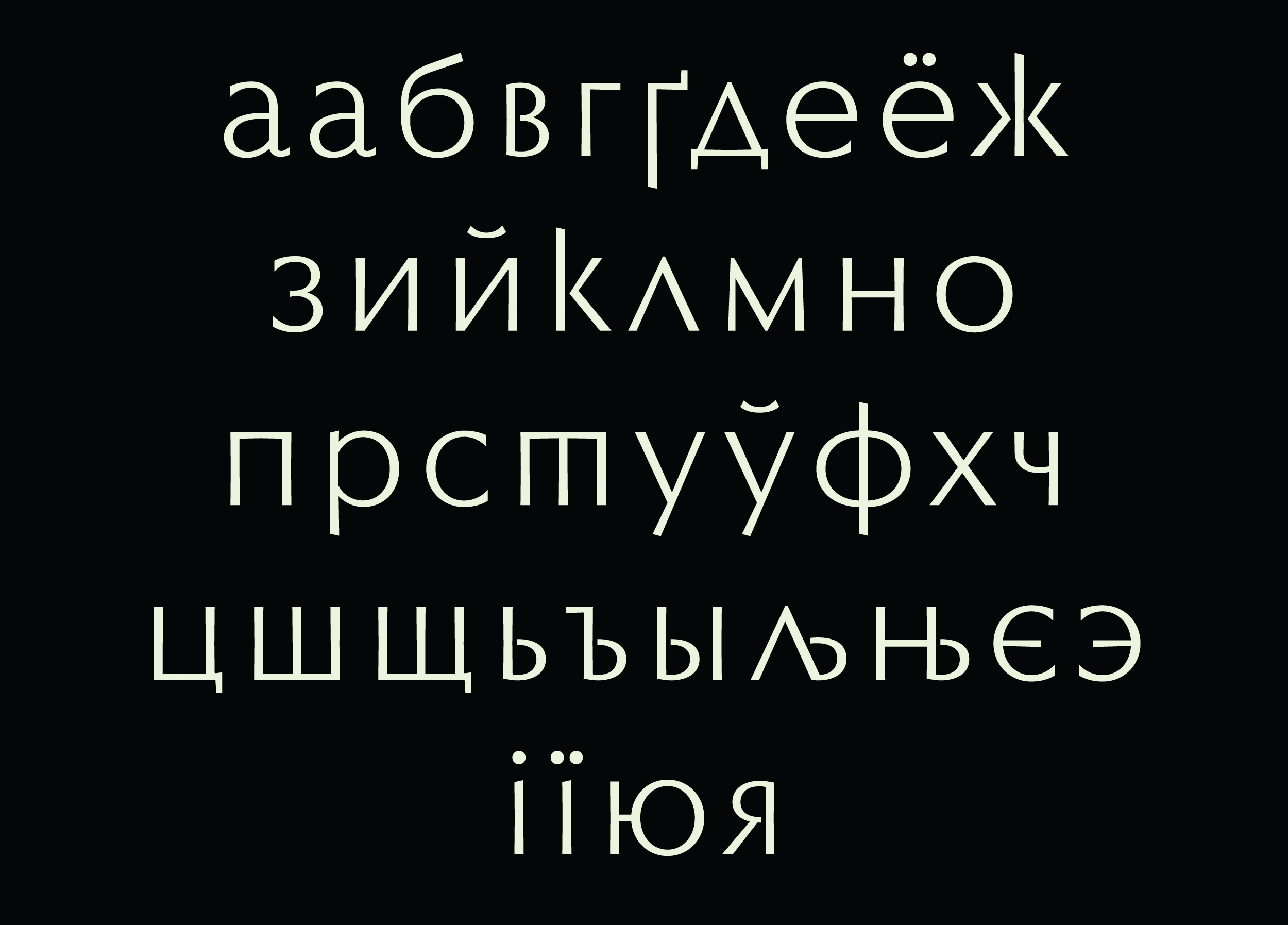
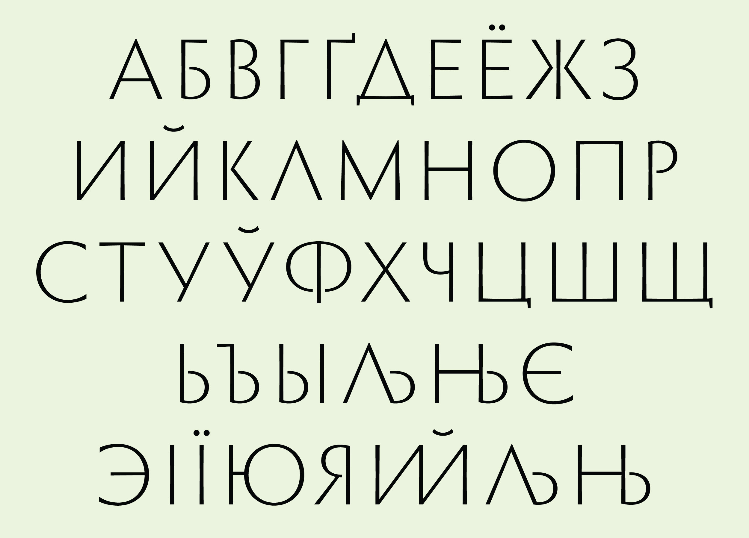
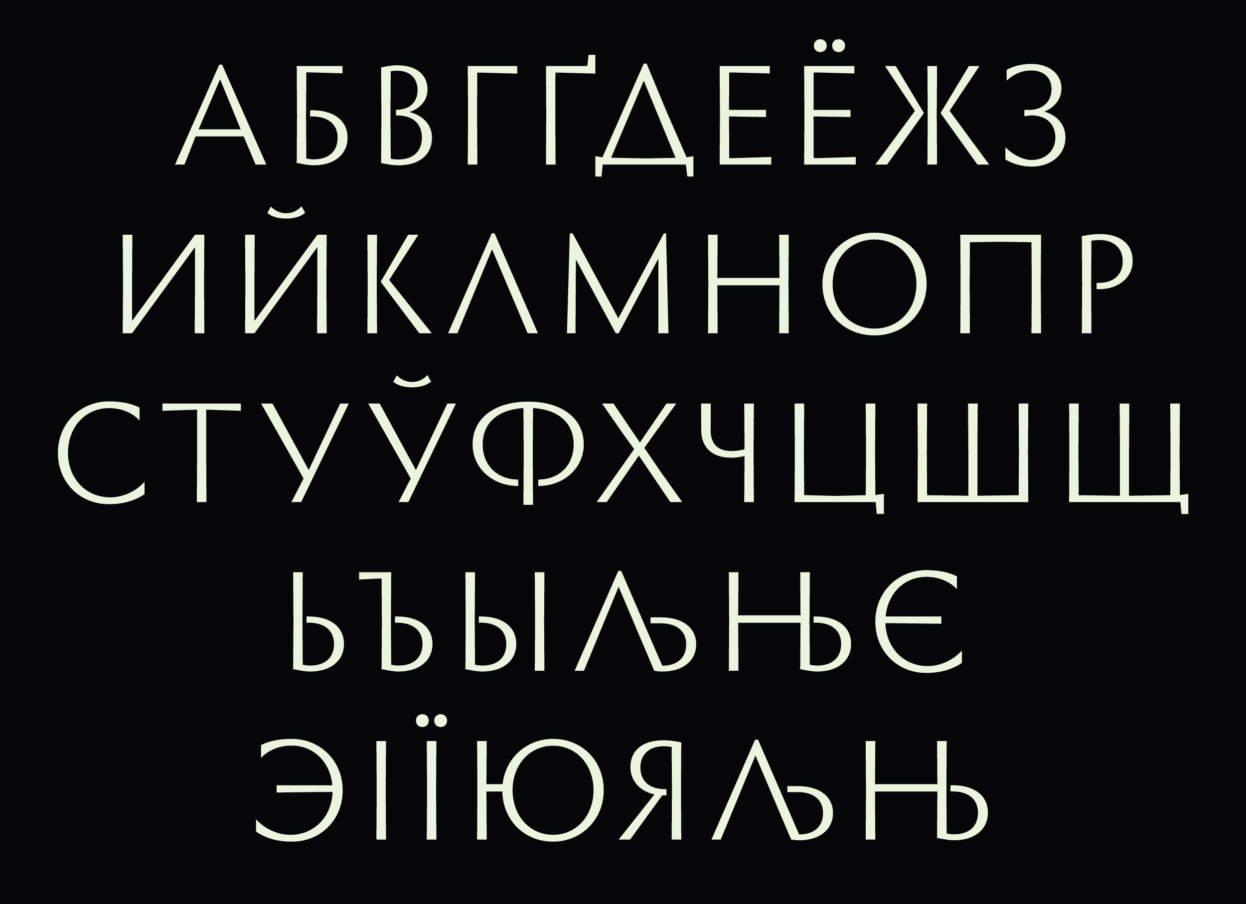
Capital roman, sans serif only.
Why Roman Capital? Restrained classic, for the auction house it is just the most suitable, here it was not necessary to focus on any historical period.
The closest relative of the Optima typeface by Herman Zapf and the font from some of the covers of the favorite Ukrainian designer of the mid-XX century, Yakiv Hnizdovsky, we have wanted to apply his style somewhere.
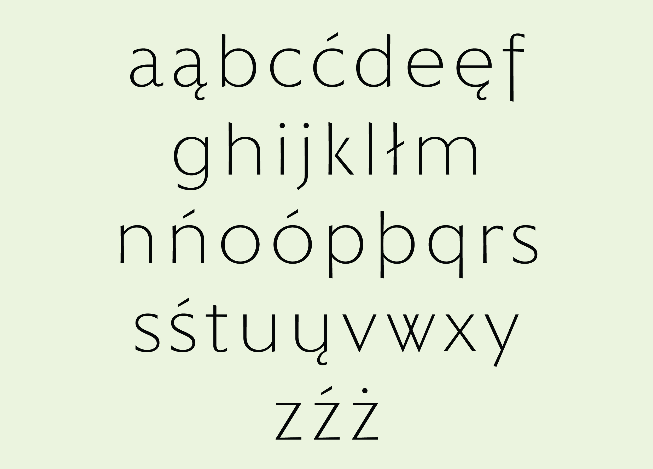
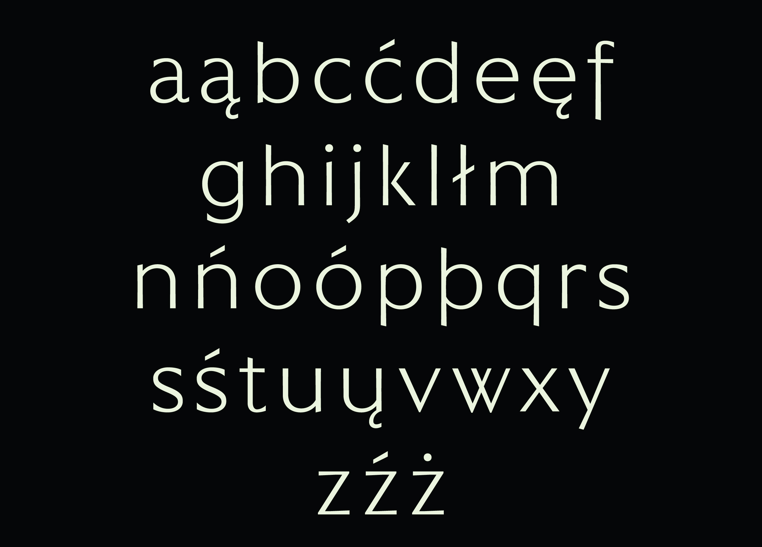
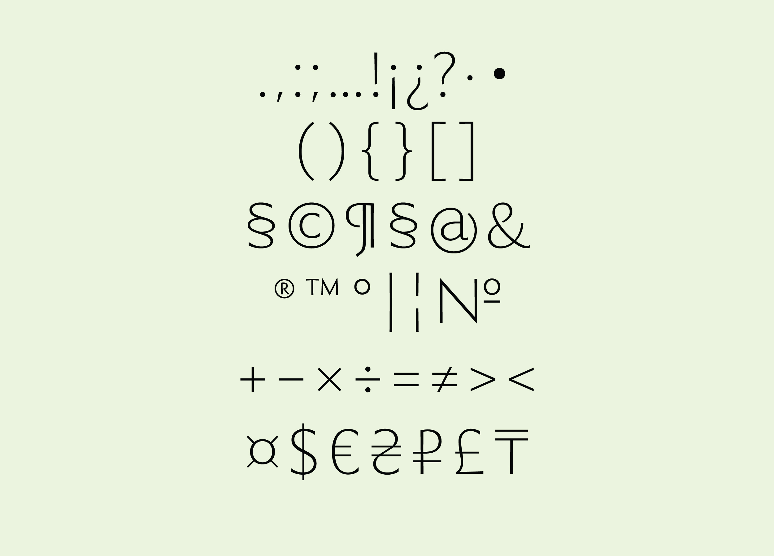
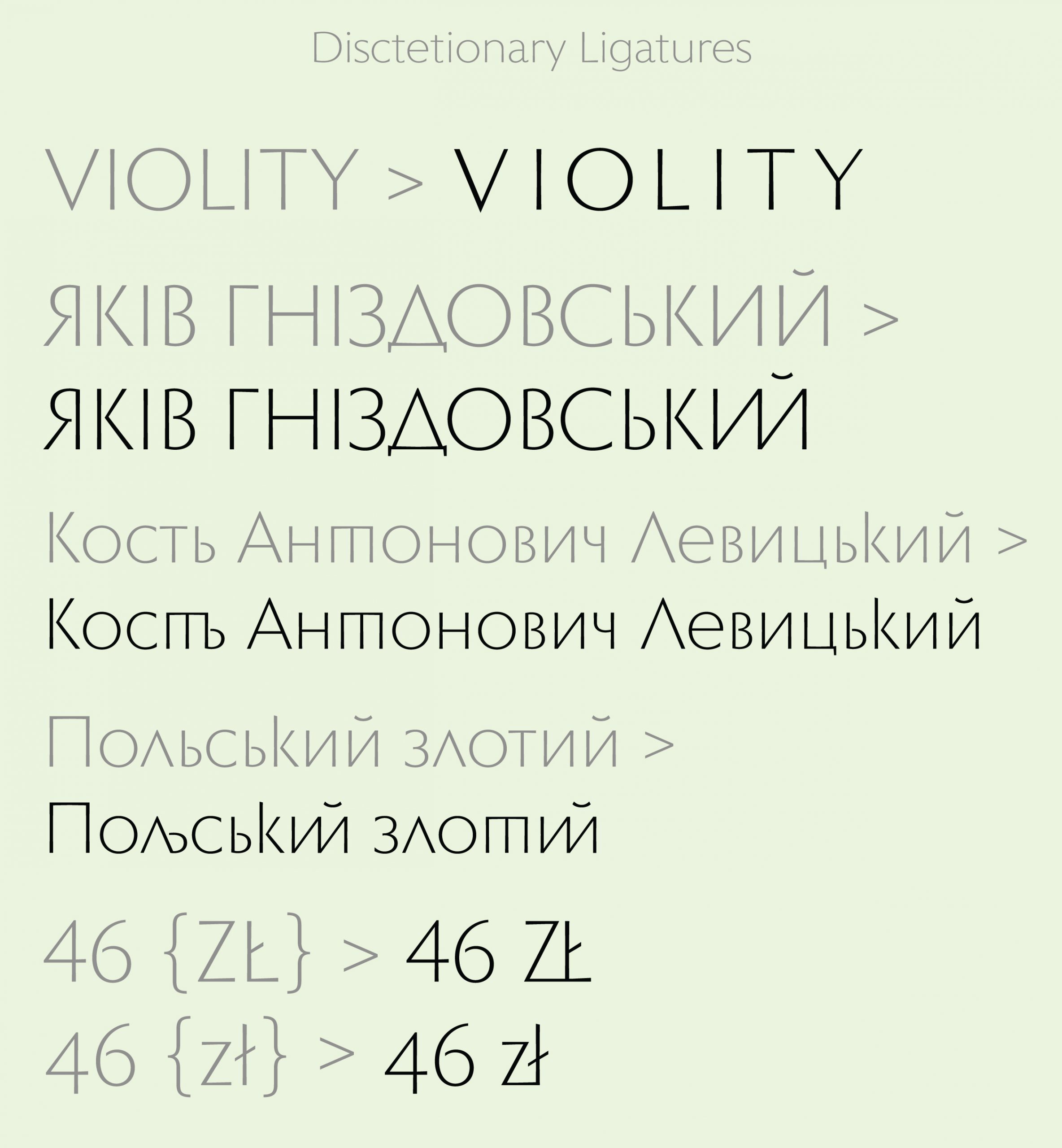
I (Vika) made completely all the letters of the Ukrainian, Russian, English and Polish languages, a few numbers and signs and asked Dmytro for a piece advice. There was little time, so Dima took up the revision of the font. The font has become more structured and thought out in detail, thanks to him so much.
Thanks also to the Violity for their trust. I consider this a joint project with the Violity team
Thanks for attention!
