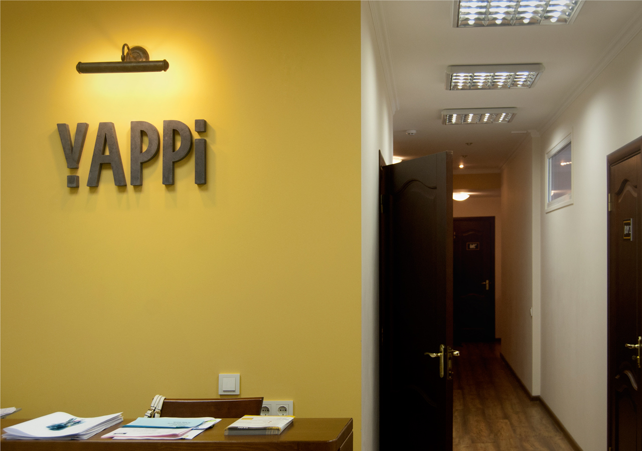
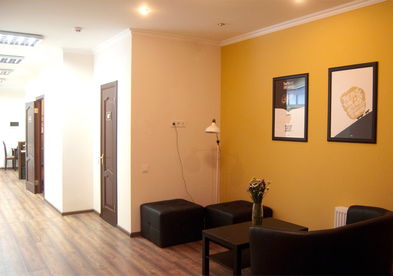
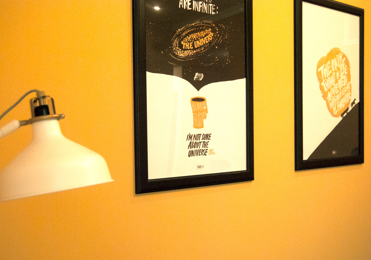
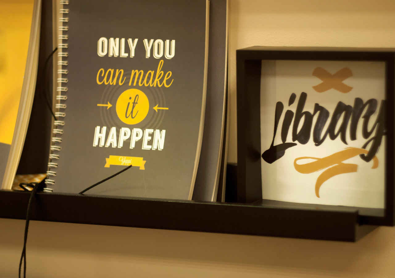
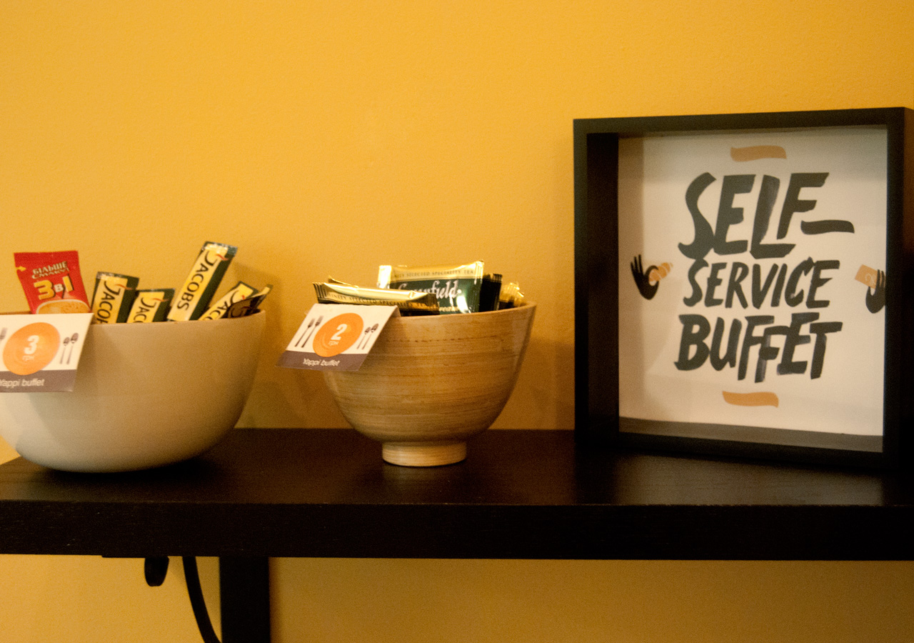
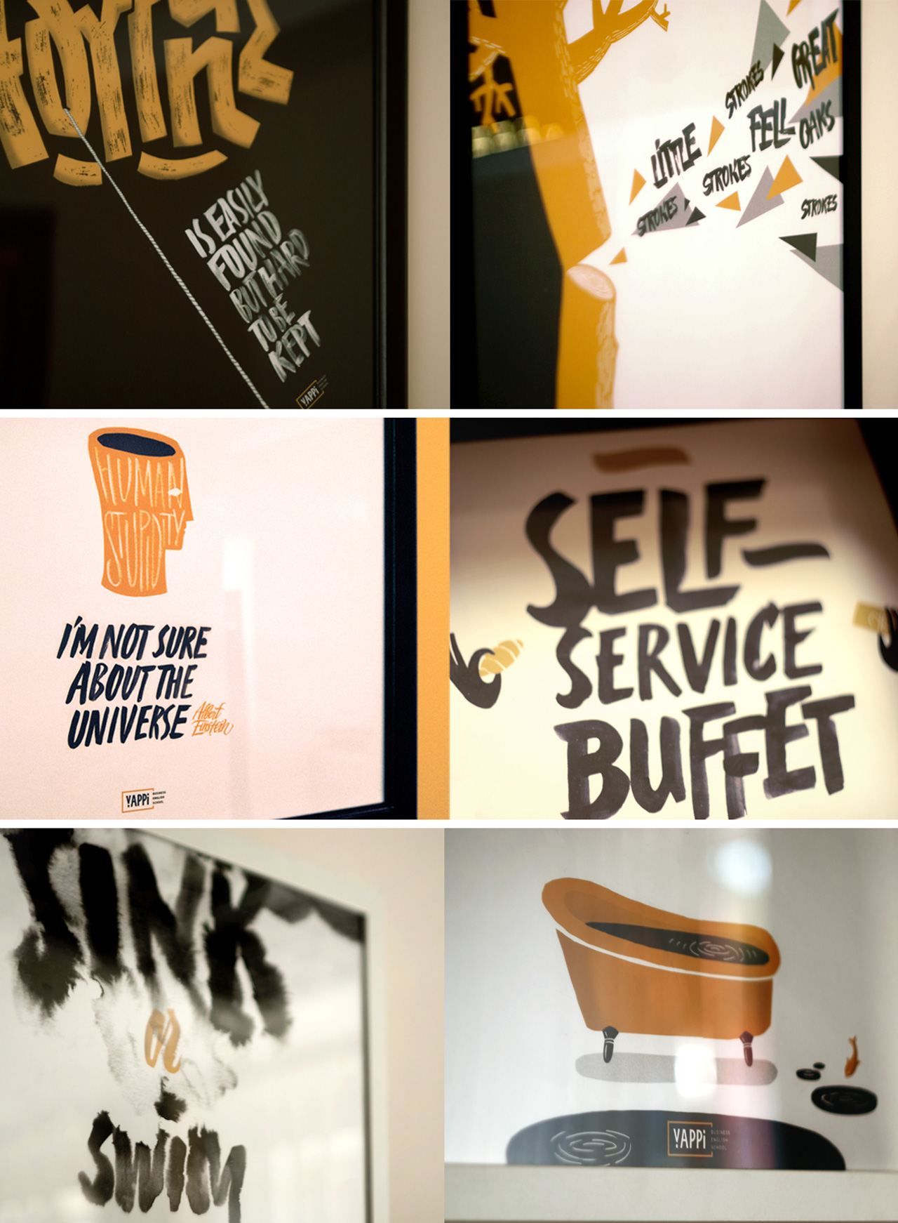
The school, which specializes in studying business English. This is a school with the status and long-term design, which needed to be updated urgently. Moving to new office opened opportunities to experiment with the interior.
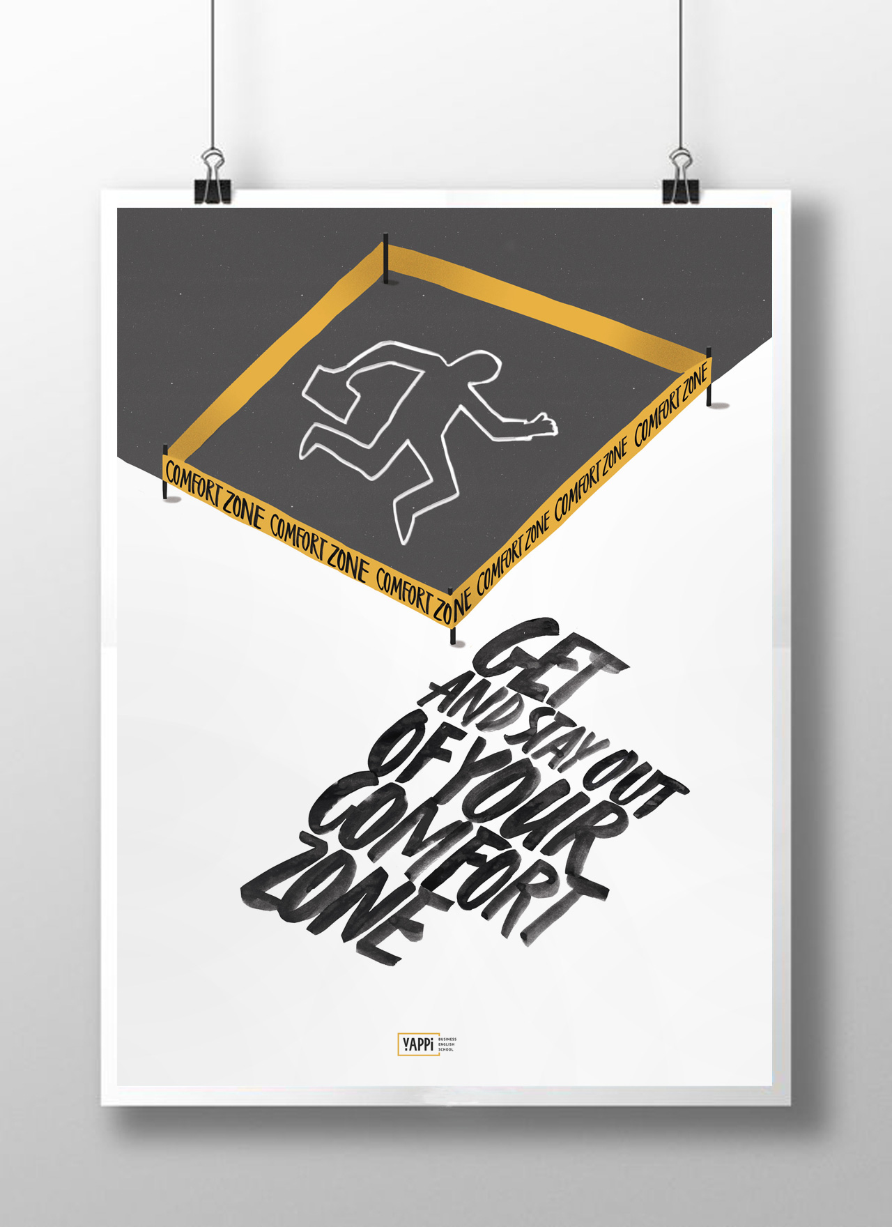
It was the long process of rethinking the concept of “yuppie” as a character. It was an object from another world – a cold and cynical, tightly bound to the material world, with a briefcase in a three-piece suit, climbing to Olympus, pushing away all mortals from his path. But our Kiev “yuppie” are not the guys from the Wall Street, of course, so here we could only accept some good and unobtrusive irony.

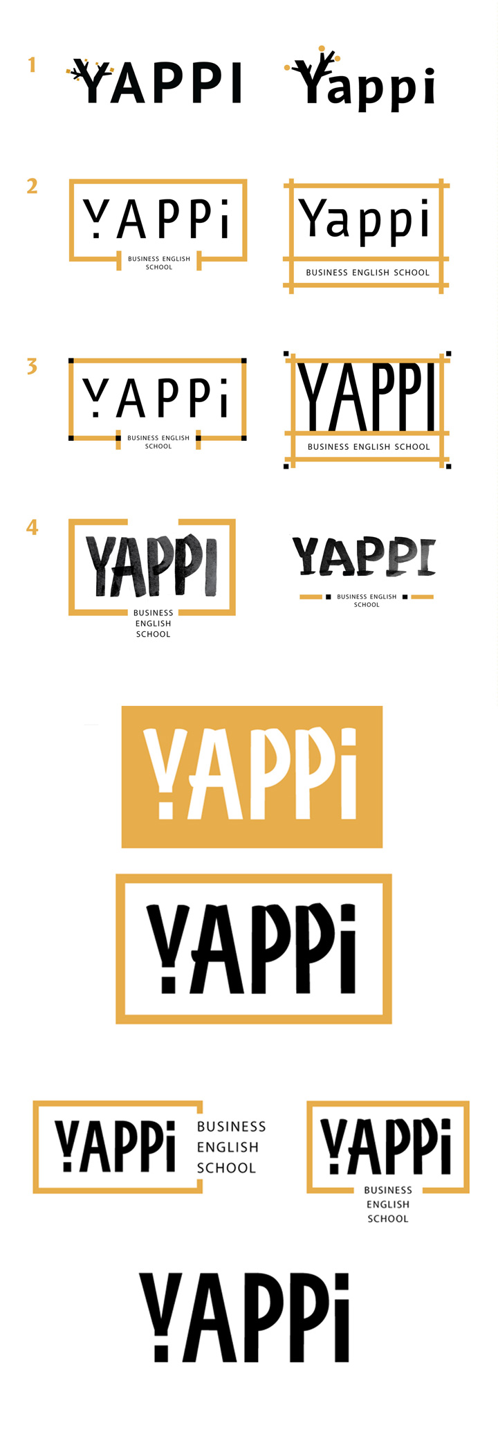
We started with the logo. Therefore it was the basis of the future stylistics. Limited colors and urban line breaks in the schedule of free style that adds the whole corporate identity contrasting expression.
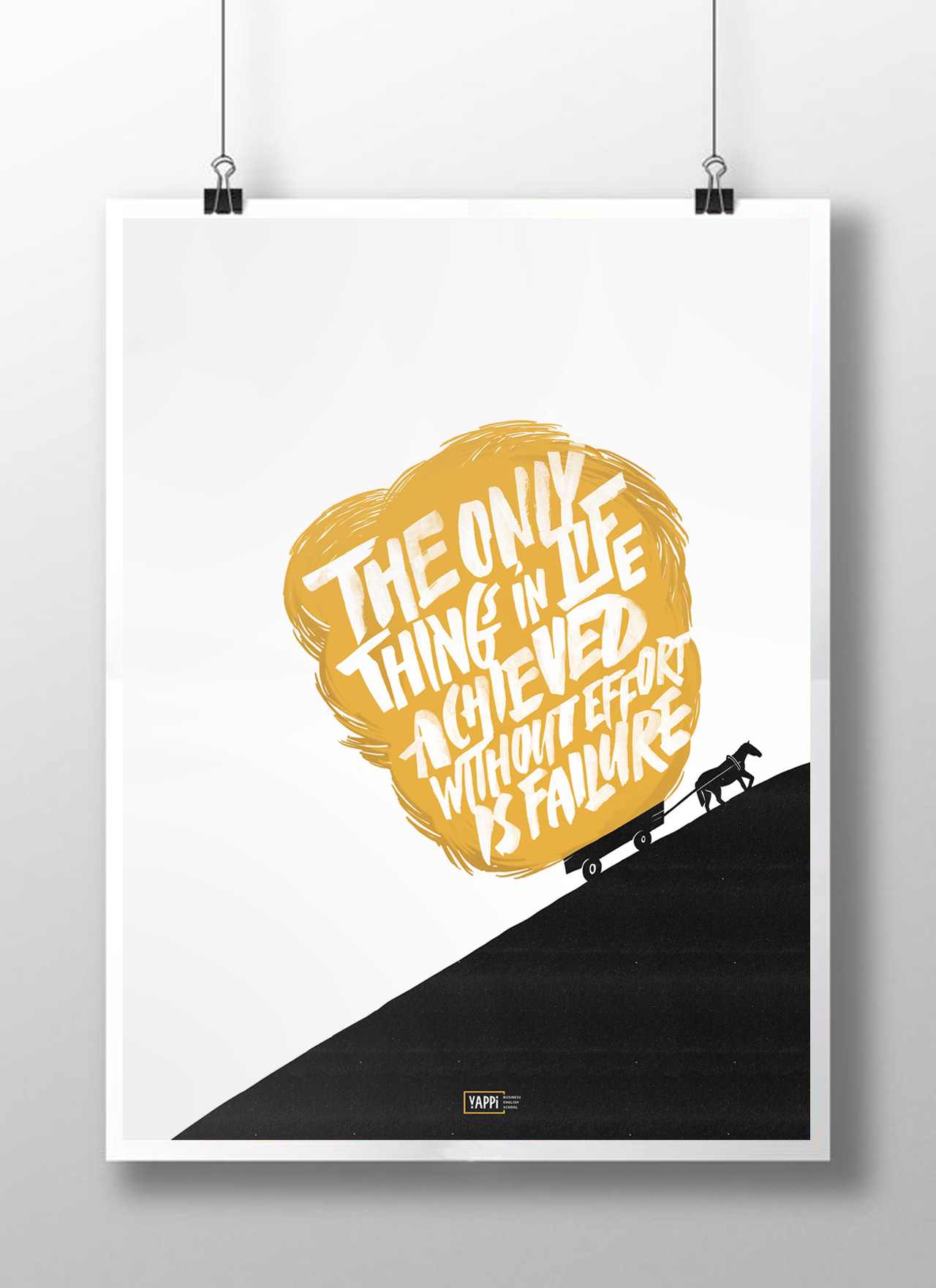
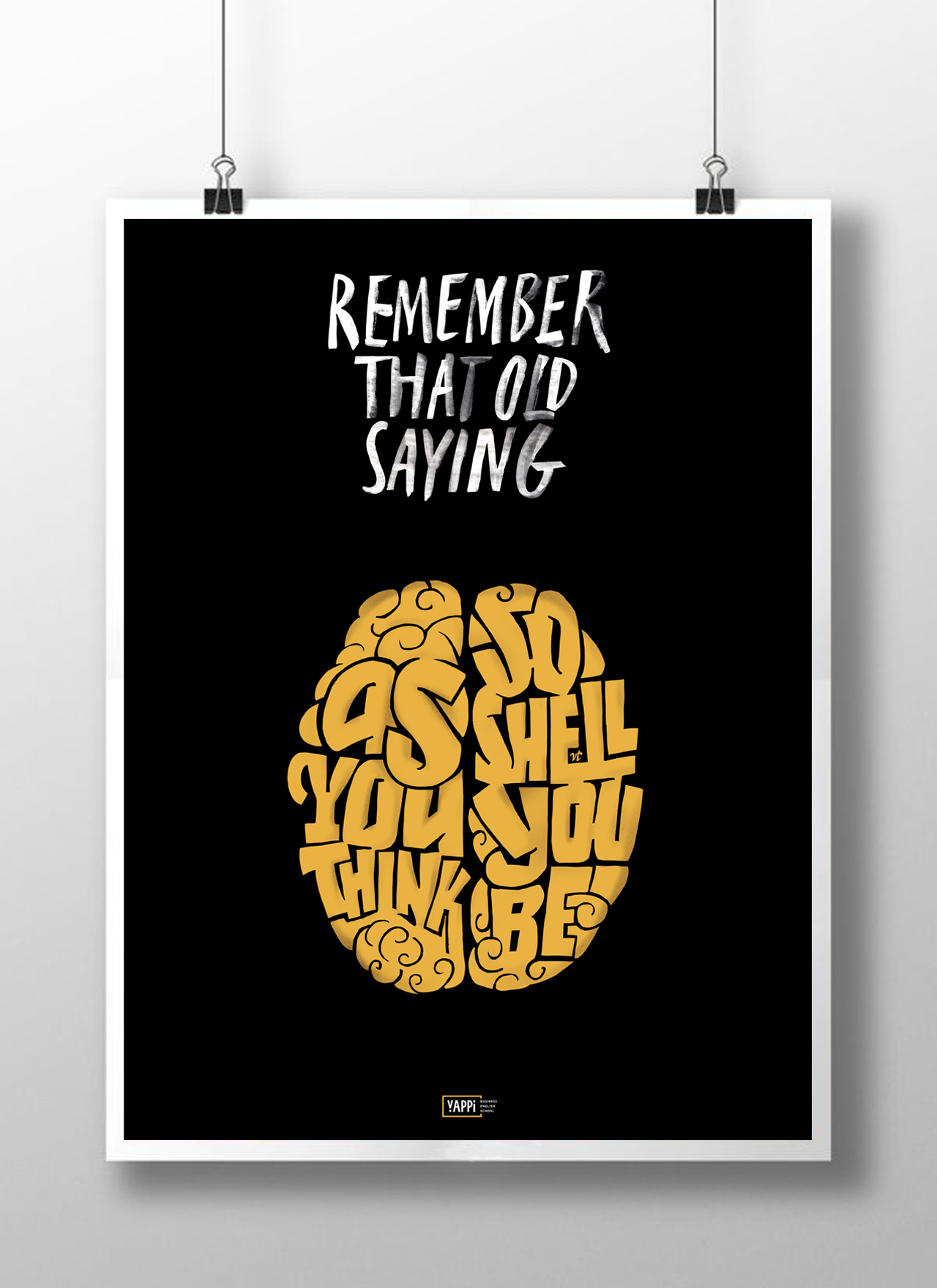
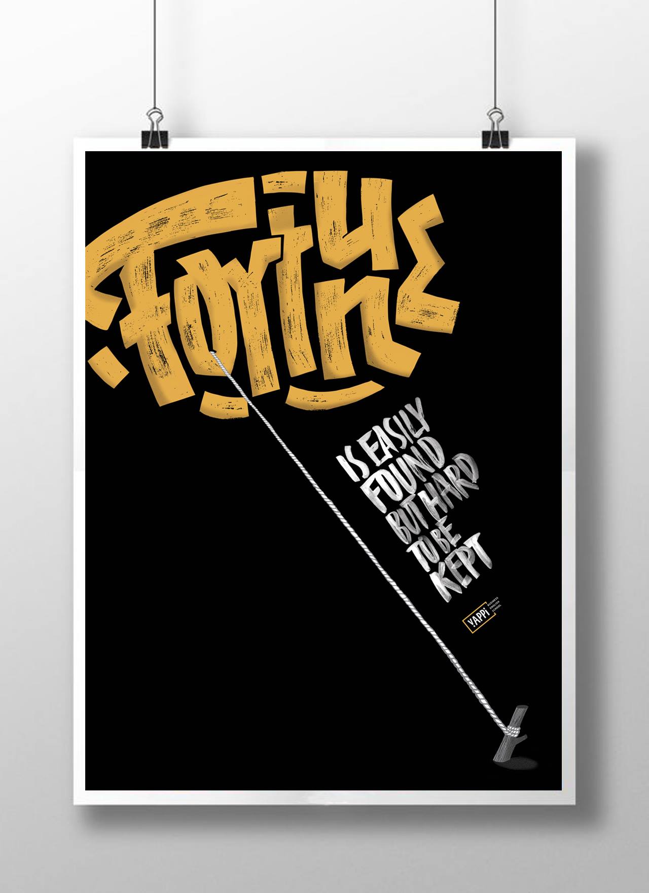
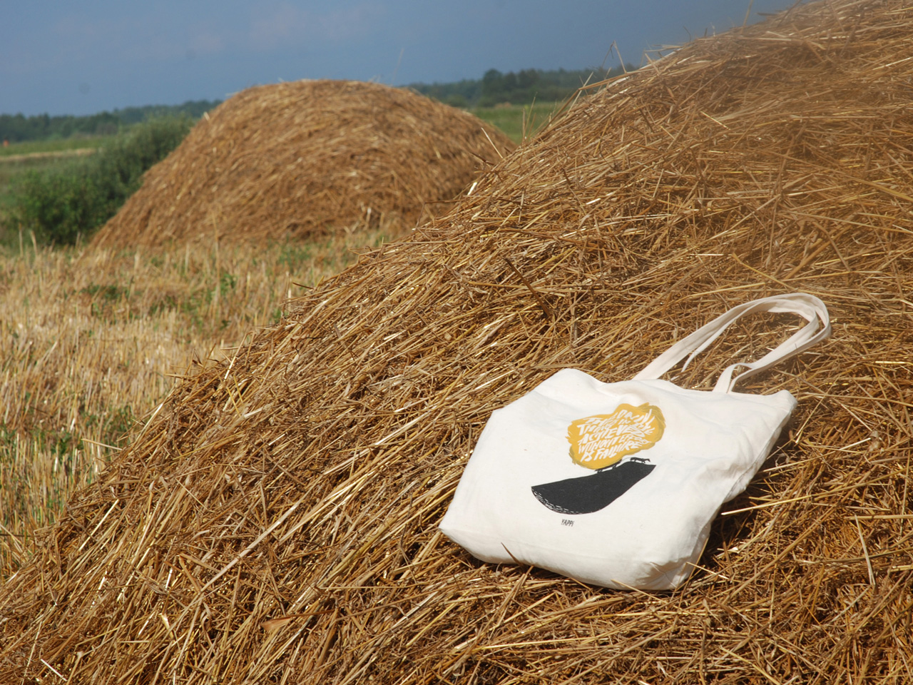
Logo, business cards, posters, billboards, ads on the beginning of the new semester, other advertising forms, certificates, booklets, notebooks in the collection Gifty (gifts in the style of “Yuppie”), gift t-shirts. We got much work to do!
