
Working with books is the most favorite and desirable lesson since my childhood. To design a book not easy, you need to feel and live the story itself, also you have to be an architect, composer and Director at the same time.
No wonder Vladimir Favorsky said about the book as an architectural object and compares it with theatrical performance.
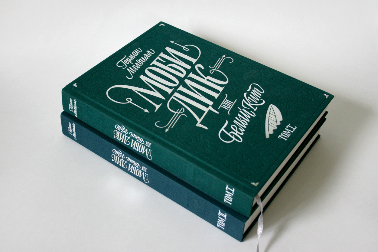
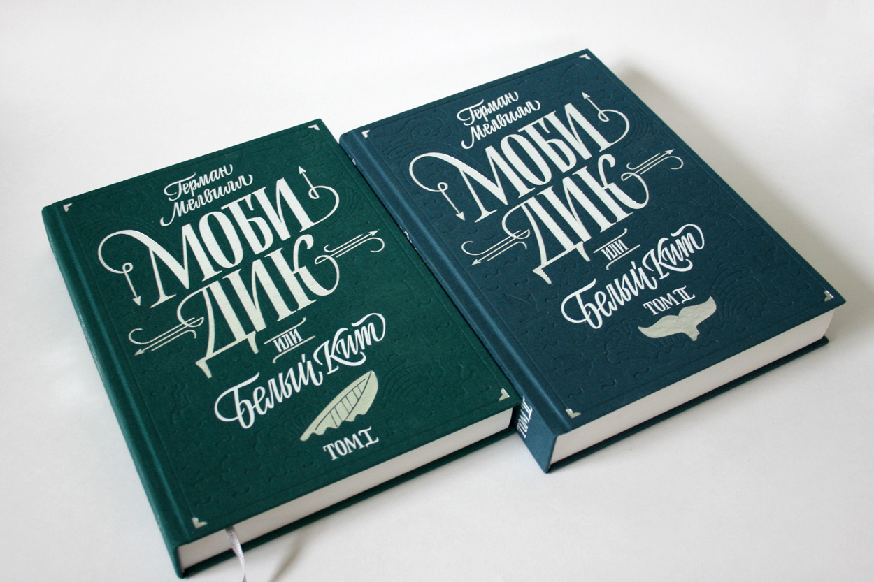
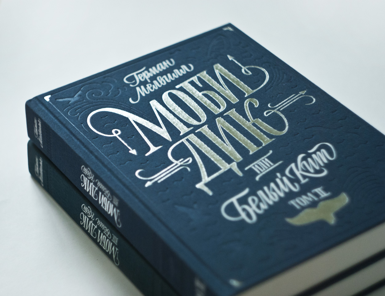
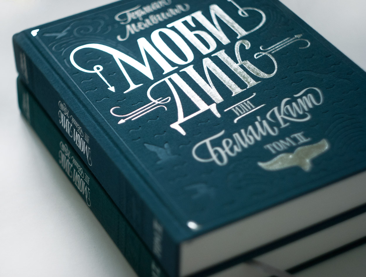
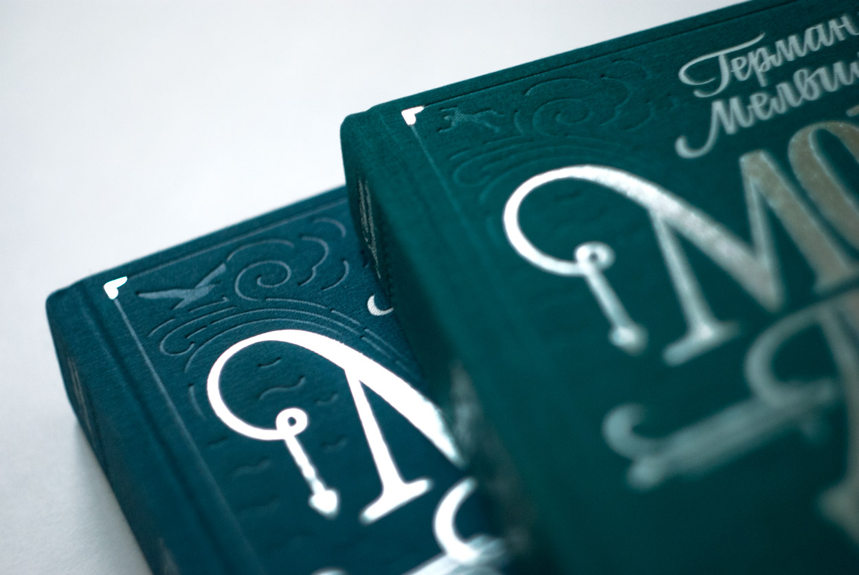
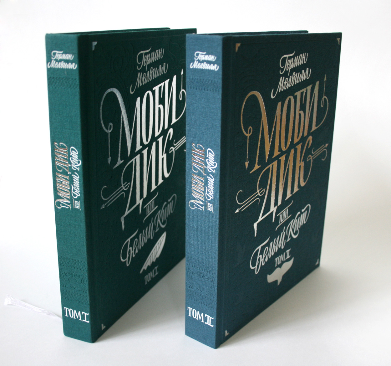
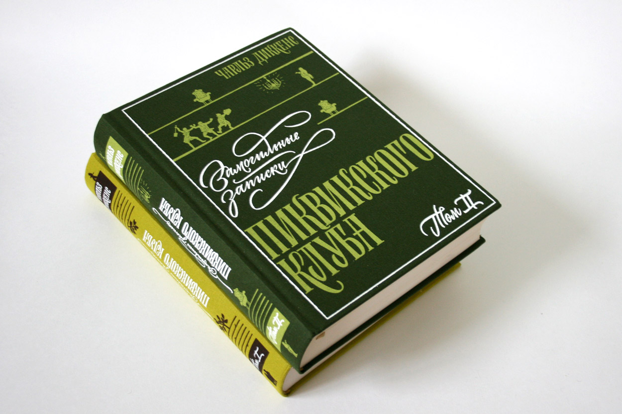
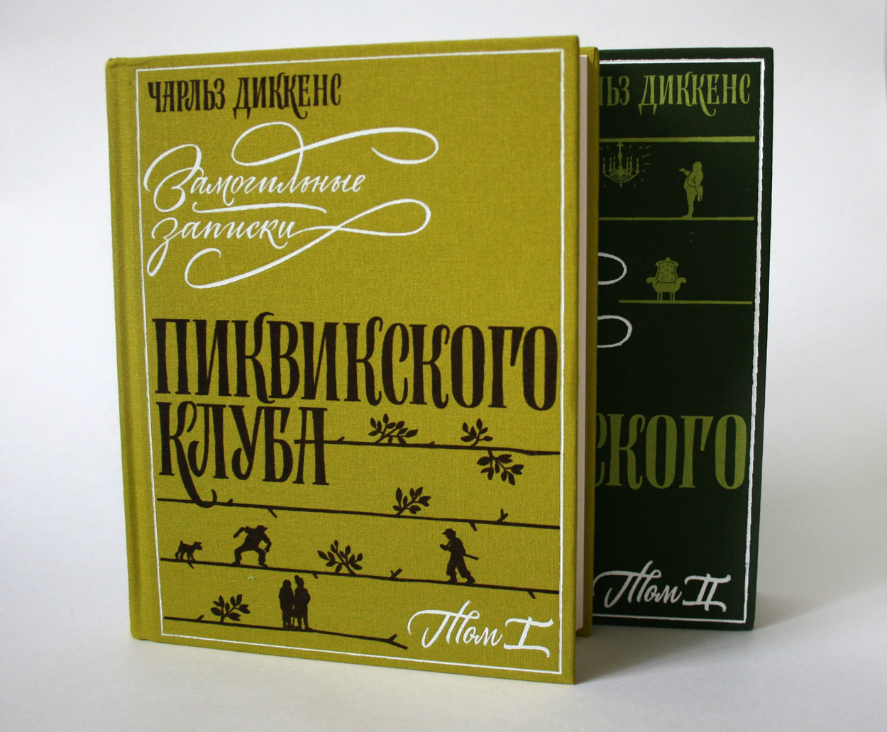
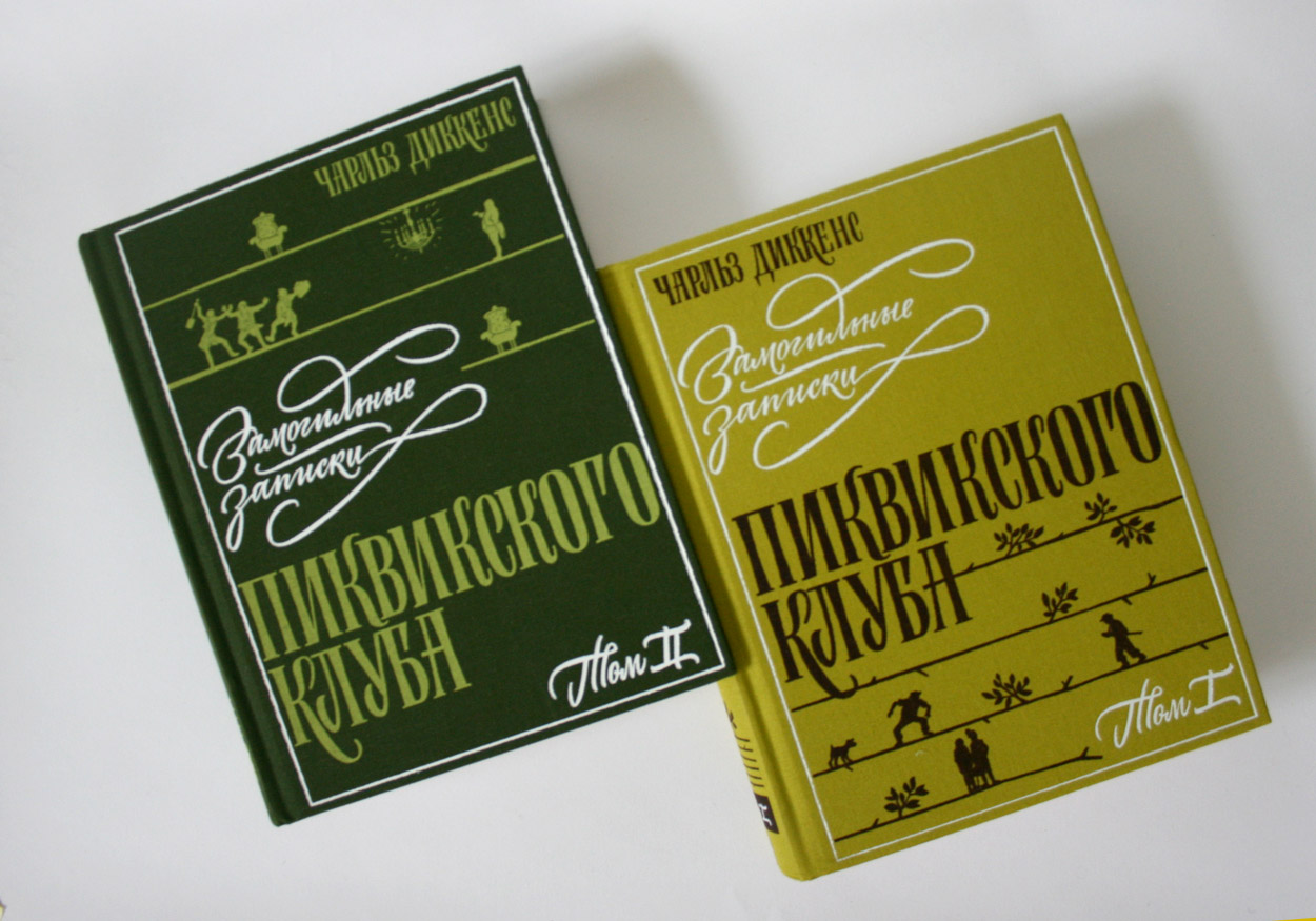
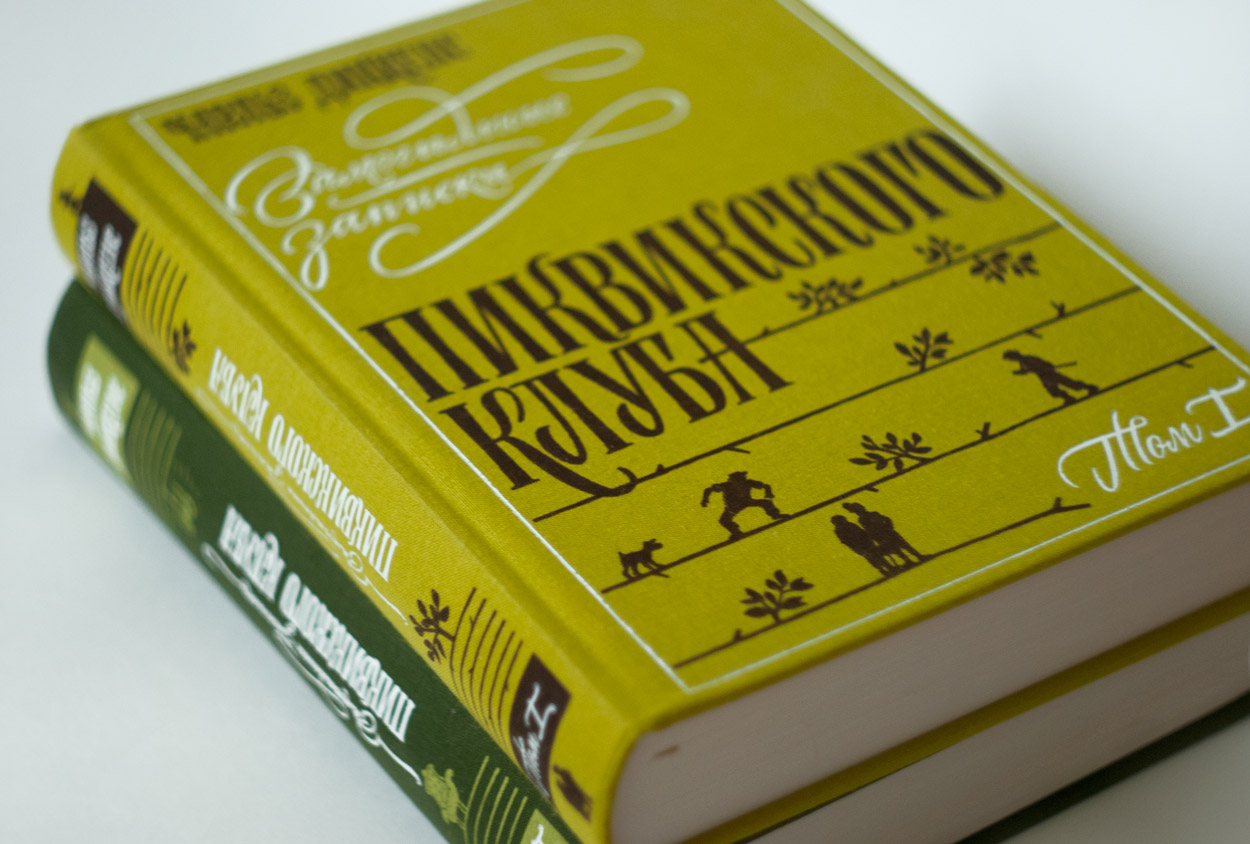
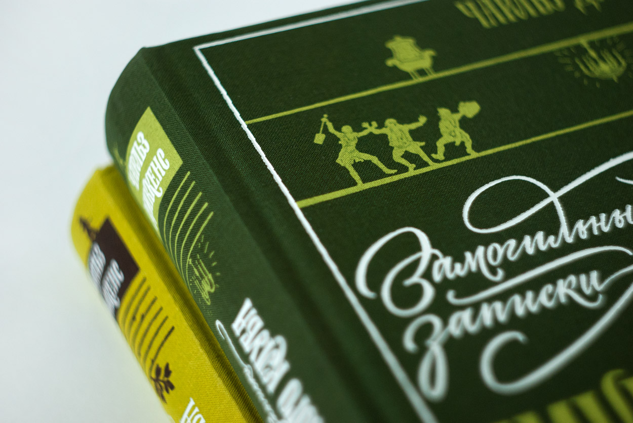
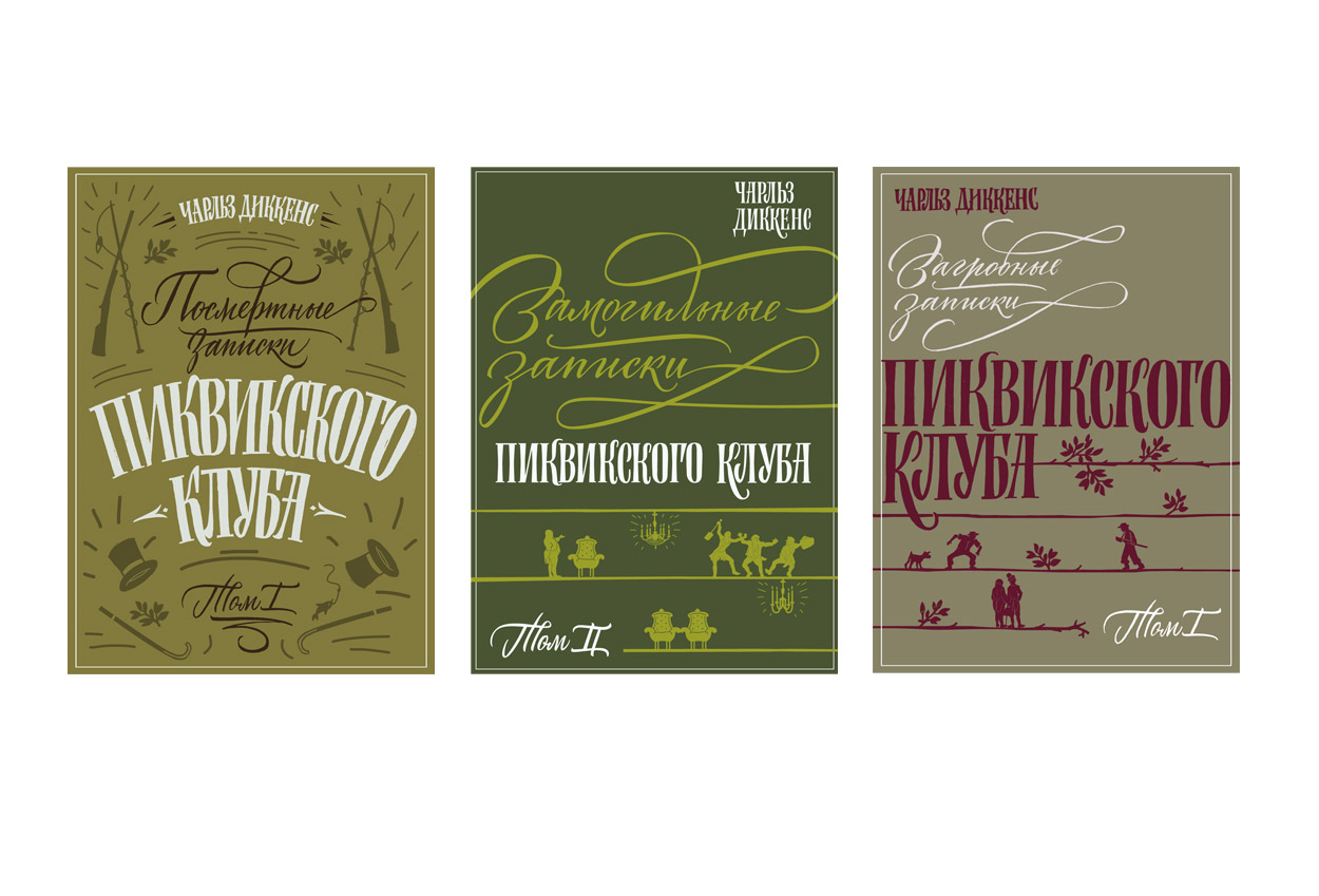
But now about the covers. Such a world classic and beloved books, like Moby Dick and the “Afterlife notes” by Charles Dickens are designer’s dream! This level of literature is difficult to design, but with a good editor with the same vision of tasks as yours it becomes insurmountable.
For “The New Academy” series we have chosen the classical approach, with emphasis on the font. “The binding has the task to save the content of the book from the street. The inscription and image on the cover, indicating the entrance and speaking in general terms the contents of the book, should not go ahead and give the main point in all the details… the image on the cover should not be very expressive, as if in silhouette, as the title decorative solution.” (V. Favorsky)
Further you can enjoy the working process and some unaccepted sketches.

Some sketches:
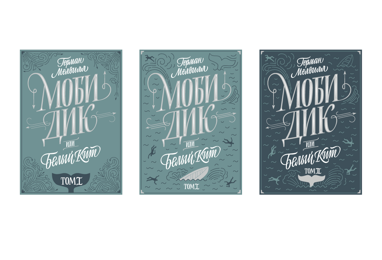

Some sketches:
Thank you for your attention, friends. Books will save the world!